Garcp: A Standout Display Font for Digital Branding
I was deep in the final round of a boutique coaching site redesign—hero section open, background image muted, and the headline still feeling flat. I’d cycled through three clean sans serifs, but none carried the warmth and quiet confidence the brand needed. That’s when I dropped Garcp into the H1 tag. Instantly, the layout exhaled. Not because it was louder, but because it felt *intentional*—like the voice behind the brand had finally stepped forward.
What Makes Garcp Shine on Screen
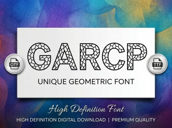
Garcp is a decorative display font built for presence—not subtlety. Its letterforms balance organic flow with refined structure: subtle tapering strokes, gentle contrast between thick and thin, and just enough personality in the terminals to feel hand-informed without sacrificing polish. It’s not a script, not a serif, not a geometric sans—it occupies its own thoughtful middle ground. In digital use, that translates to strong visual hierarchy, immediate tonal clarity, and a sense of crafted authenticity that resonates especially well on landing pages, portfolio headers, and brand-led sites.
Real Layout Testing: Where It Works (and Where It Doesn’t)
I tested Garcp across six real scenarios: a hero banner over a textured photo, a sticky navigation bar on scroll, a CTA button on a light background, a section heading in a course sales page, a blog post title with a dark overlay, and a mobile-only preview at 320px width.
Here’s what stood out:
- Hero headlines — Perfect. At 48–64px on desktop and 32–40px on mobile, Garcp held weight and legibility even over soft-focus imagery. The spacing between letters felt generous, never cramped.
- CTA buttons — Worked beautifully at 18–20px on light backgrounds, but I avoided it on dark or busy gradients where fine details softened. A subtle text-shadow helped when needed.
- Section headings — Excelled in editorial layouts—especially paired with a neutral sans serif like Inter or Manrope for body copy. The contrast elevated content without overwhelming it.
- Mobile responsiveness — Held up cleanly down to 28px on iOS Safari. Below that, some letter shapes (like the lowercase ‘a’ and ‘g’) began to lose distinction. Best reserved for headings—not subheads or captions—on small screens.
- Accessibility note — While visually expressive, Garcp isn’t designed for long-form reading. I kept it strictly for display roles: titles, banners, logos, and short accent phrases. Never for paragraph text, form labels, or navigation links.
Pairing It Thoughtfully in Web Design
Garcp thrives when grounded. I consistently paired it with a highly legible, low-contrast sans serif—Inter for most projects, and occasionally Lora for a more editorial tone on blog headers. The contrast wasn’t jarring; it was purposeful. Garcp brought character, while the supporting font delivered clarity and breathing room. For brands leaning into handmade or artisanal vibes, I even tested light pairings with a restrained script (like Quicksand Light) for secondary accents—but only in controlled, spacious layouts.
One unexpected win? Using Garcp for logo-type treatments in SVG format. Its clean vector outlines rendered crisply at any size, and the subtle alternates included in the font file added just enough variation for social avatars or favicons without needing custom lettering.
Technical Fit for Real Projects
Before deploying, I checked what was included: WOFF2 and WOFF files (ideal for web), full Latin character support, standard ligatures, and stylistic alternates for both uppercase and lowercase. No OpenType features were buried or inaccessible—everything worked natively in modern browsers and Figma. Licensing was clearly stated for commercial use, including client websites and SaaS dashboards (with proper font hosting). I appreciated that multilingual support covered Western and Central European languages—enough for most small-business global audiences without overpromising.
Performance-wise, the WOFF2 file clocked in under 48KB—light enough to load fast, even on slower connections. No FOIT or FOUT drama during testing; fallbacks behaved gracefully, and the font swapped in smoothly after initial render.
When to Reach for Garcp—and When to Pause
Reach for Garcp when you need:
- A confident, memorable headline on a product landing page
- A distinctive yet professional header for a creative portfolio or agency site
- Brand-aligned typography in a digital brand kit or style guide
- Short, high-impact text overlays in promotional banners or email headers
- A cohesive typographic anchor across web, social graphics, and digital ads
Pause before using it for:
- Body copy, interface labels, or anything requiring sustained reading
- Small UI elements like dropdown menus, pagination, or tooltip text
- High-contrast accessibility-critical contexts (e.g., error messages or legal disclaimers)
- Dynamic text that changes frequently—its personality shines best when curated, not automated
In the end, Garcp didn’t just “look nice.” It solved a design problem: how to communicate warmth, intention, and quiet authority—all without saying a word beyond the headline. It’s become my go-to display font for projects where voice matters as much as visuals—and where every pixel serves the brand, not just the layout.